What was previously just speculation, albeit well-informed speculation, has now been confirmed. The NHL will be introducing a new "fourth jersey" for all 31 teams next season under the "Reverse Retro" series.
These jerseys won't replace current third jerseys but will be an additional jersey likely only worn for a limited number of games. Reports indicate that these jerseys will be "throwbacks with a twist" and some of the designs have already been leaked, showing exactly what that looks like: a classic jersey from the past brought back with new colours.
The NHL teased the jerseys on social media with a 22-second video that showed the colours that would be used for each jersey, as well as a cryptic hint at which classic jersey from the past each team will be using.
— NHL (@NHL)
It didn't take long to figure out that the numbers on the back of the jersey in the video correspond with either the year a new jersey was introduced or an important year in that franchise's history.
For example, the Anaheim Ducks jersey in the video had the number 95 on the back, referencing the 1995-96 season when they wore the "Wild Wing" third jersey, featuring a cartoonish duck goaltender bursting out of the ice. Leaks suggested the twist on this jersey would be a primarily orange colour scheme, but the NHL's video instead suggests it will mostly be white instead, a change from the original teal.
The Tampa Bay Lightning, on the other hand, have "04" on the back of their jersey, a reference presumably to winning their first Stanley Cup in 2004 while wearing a largely-unchanged version of their original jerseys from when they joined the league. Those jerseys were either white or black, while the Reverse Retro version will instead be primarily blue like their current home jerseys.
So, what does that mean for the Canucks?
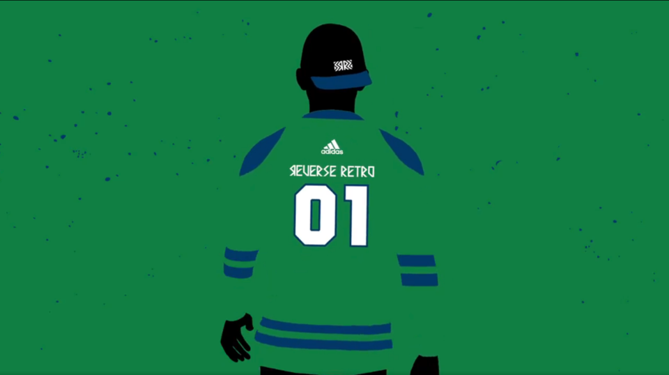
The Canucks posted their own clip from the NHL's video, confirming the blue-and-green colour scheme for their upcoming Reverse Retro jersey. The main colour in the video is green, suggesting the first mainly green jersey in the team's history. The question is which jersey? They have no shortage of oddball jersey designs in their past that would work for this one-time twist.
— �鶹��ýӳ��#Canucks (@Canucks)
The hint is in the "01" in the video. In 2001, the Canucks introduced a new third jersey to go with their white and navy blue home and away sweaters. Like their previous third jersey, the "salmon" skate, it featured a gradient that transitioned from one colour to another instead of one solid colour.
The third jerseys used the maroon that was a tertiary colour in the original jerseys, fading to a navy blue at the top of the jersey. It lasted from 2001 to 2006 and the team — along with the rest of the NHL — hasn't used a gradient in a jersey since.
If the Canucks are bringing back the gradient, they'll be doing in the blue-and-green colour scheme of their current jerseys. Since kelly green is the team's secondary colour, it's easy to assume that it will be the colour at the bottom of the jersey, transitioning to royal blue at the top, with a kelly green shoulder yoke and sleeves.
A few different Canucuks fans took a stab at what they think this jersey will look like, including this version that is directly based on the original 2001 gradient jersey.
Looks like the will be going with the gradient reverse retro jersey based on the year. Here's a quick mock-up:
— Hans (@S7Dsn)
Others gave the jersey a different twist, like this version that incorporates a modernized flying skate logo.
Canucks Gradient Jersey Concept
— BIZ (@13isnasty)
The idea of bringing back the gradient isn't new, of course, as illustrated by designer Andrew Weiss earlier in the summer.
Alternately, maybe the "green" jersey isn't referring to the colour of the jersey at all, but instead Canucks head coach Travis Green.
Rare sneak peek
— Dylan (@dagmarrr)
For now, it's unclear whether the Canucks' actual Reverse Retro jersey will echo any of these designs. Well, we can be pretty sure that it won't be that last one. While the gradient jersey used the current orca logo, the Canucks could choose to use one of their other logos in their Reverse Retro look, such as the stick-in-rink, Johnny Canuck, or even the �鶹��ýӳ��Millionaires logo.
pick your canucks retro gradient
— Vanessa Jang (@vanessajang)
Whatever design the Canucks go with, the hope is likely that additional jersey sales will help offset some of the lost revenue from having to play a shortened season due to the COVID-19 pandemic. By bringing back an older jersey design with a new twist, it will give jersey collectors something unique to add to their collection.
Bringing back another orca jersey for the Reverse Retro series, however, do little to assuage Canucks fans that want the team to bring back the skate jersey full-time after it was so popular last season in limited usage. Nor will it soothe those hoping to see Johnny Canuck used as a main logo.
Perhaps the Canucks should have consulted with their resident style maven: Elias Pettersson.
UPDATE
The Canucks have released a further tease of their Reverse Retro jersey, which falls in line with expectations: it appears to be the 2001 gradient third jersey with green instead of maroon.
Details from the past. Remixed for the future. adidas coming soon.
— �鶹��ýӳ��#Canucks (@Canucks)
The one key difference from the fan mockups is that the blue appears to be much closer to the navy blue the Canucks wore during the early 2000s in their original orca jerseys rather than the royal blue of their current jerseys. That will provide an interesting contrast to their usual home and away sweaters and set this Reverse Retro jersey apart.
Which classic sweater should the twist up for the NHL's rumoured 'Reverse Retro' jerseys next season?
— Daniel Wagner (@passittobulis)


.JPG;w=120;h=80;mode=crop)

