Rumours are swirling among hockey jersey aficionados that the NHL will introduce a new “fourth jersey” concept for the 2020-21 season.
Most teams in the NHL have a third jersey in addition to their regular home and away sweaters — a special jersey for special occasions or, for those more cynical, an additional way to pry cash out of the wallets of their fanbase. For next season, each team will have an additional jersey with a retro theme.
According to hockey design site Icethetics, these jerseys will be part of a series of Reverse Retro jerseys, described by their sources as “throwbacks with a twist.” and behind the Reverse Retro theme, including those for the Pittsburgh Penguins, Philadelphia Flyers, Vegas Golden Knights, and Anaheim Ducks.
The speculation is that these jerseys will replace some of the merchandising revenue lost when the league had to . Instead of selling the retro jerseys from the Winter Classic or the All-Star jerseys of the best players in the league, teams will hopefully make up for those lost sales with these one-of-a-kind Reverse Retro jerseys.
For the most part, these are essentially old jerseys with a palette swap. The Penguins took their third jersey from 1992, a black Penguins wordmark jersey, and made it white. The Flyers switched the colour of the shoulder yoke of their popular 80’s jerseys — boring. The Ducks are certainly less boring, reportedly bringing back their wildest jersey ever — a cartoonish jersey with their mascot, Wild Wing, bursting out of the ice — and swapping the original teal colour for the orange of their modern jerseys.
More 4th jersey leaks? Here’s what to expect for the and when the Reverse Retro series becomes official. Details on the blog.
— icethetics (@icethetics)
The Golden Knights, who don’t quite have the history to go retro, went in a different direction. They reportedly dug into their hockey past and pulled up the Las Vegas Thunder, who played in the International Hockey League from 1993 to 1999, and swapped out the colours.
That opens up some interesting possibilities for the Canucks, whose Reverse Retro jerseys have yet to be leaked.
This last season, the Canucks already had some retro jerseys as part of their 50th anniversary celebrations. In addition to their regular orca home and away jerseys, they had the , and got , their classic black flying skate jersey from the 90’s.
The Canucks also wore several different throwback jerseys for warmups. The original stick-in-rink jersey was brought out for 70’s night, the much-maligned yellow flying-V jersey for 80’s night, and the West Coast Express-era navy and maroon orca jerseys on 2000’s night. With so much retro last season, how can the Canucks create something different for their Reverse Retro jerseys?
Quite frankly, I don’t really want to see the flying skate in blue and green — it really needs three colours to pop — and I’ve seen enough variations on the stick-in-rink to last a lifetime. I want to see the Canucks do something truly different.
Let’s look at a few options.
1 | A palette-swapped flying-V
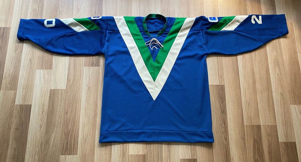
With the Ducks using the most bizarre jersey in their history, the Canucks could follow suit, bringing back the flying-V, albeit with the colours swapped out to match their current look.
Vancouver-based jersey creator Wafflebored has already done exactly that, making a royal blue and kelly green flying-V jersey earlier this year. It’s a gorgeous look that fits the Reverse Retro theme perfectly.
Made myself a blue V jersey. Had to wait to get off white material to match the vintage felt crests. Goalie George Gardner wore 20 as the team had 3 goalies the first year. Contrasting satin nameplate based on the Nov 2/77 game.
— Wafflebored (@wafflebored)
To be honest, I don’t even want to continue this list. If the Canucks don’t go with this look for their Reverse Retro jersey, I’m going to be horribly disappointed. But the show must go on.
2 | Bring back Johnny Canuck
Certain segments of the fanbase have been clamouring for the Canucks to bring back a truly vintage look. Before the Canucks joined the NHL, they played in the Pacific Coast Hockey League, which became the first iteration of the WHL. Those ย้ถนดซรฝำณปญCanucks wore a few different jerseys, including one with a familiar mascot: the lumberjack with a hockey stick, Johnny Canuck.
The Canucks have incorporated Johnny Canuck into a few different jerseys as a shoulder patch, but have never worn it as a primary logo on a jersey in the NHL. They could rectify that with their Reverse Retro jersey and please a lot of Canucks fans in the process.
It would also be a chance to switch up the primary colour of the jersey. While kelly green has been a secondary colour for the Canucks, they’ve never had it as a primary colour on a game-worn jersey, though it’s been in use on practice jerseys.
What would that look like with Johnny Canuck? The Canucks have already made that jersey, selling it through the team store as a “fashion jersey” that never hit the ice.
The are making waves with this green Johnny Canuck fashion jersey.
— icethetics (@icethetics)
BLOG:
//
The only issue I have with this jersey is that the logo doesn’t really pop out from the green, since Johnny Canuck is also wearing a green shirt. Perhaps it would work better on white, but then it wouldn’t have the colour-swapped twist of the other Reverse Retro jerseys.
3 | Maybe the Millionaires
For the 2014 Heritage Classic, the Canucks dug deep into ย้ถนดซรฝำณปญhockey history and dressed like Stanley Cup Champions: the ย้ถนดซรฝำณปญMillionaires.
The Millionaires won the Stanley Cup in 1915, the first time the Cup was not a Challenge Cup but instead a competition between the champions of the top two leagues in North America: the NHA and PCHA. Their jerseys are simple, but classic: “Vancouver” spelt out in a V shape, with multi-striped sleeves.
It would be easy enough to swap out the colours for the modern royal blue, perhaps with some green stripes on the sleeves like .
 photo: S7Dsn
Part of the appeal of the Millionaires jersey, in my opinion, is the vintage maroon colour. Losing that really dulls my interest.
The other issue is that the Canucks have had nothing but terrible luck in Millionaires jerseys. The Heritage Classic brings back terrible memories: John Tortorella started Eddie Lack instead of Roberto Luongo, which was the straw that broke the camel’s back, leading directly to Luongo getting traded back to the Florida Panthers.
The Canucks lost the Heritage Classic, blowing and early two-goal lead. When they brought back the Millionaires jerseys again the following season, the Canucks lost every time they wore them.
Perhaps it’s best if the Canucks leave the Millionaires in the past.
4 | Get really weird: it’s VooDoo time
If the Golden Knights can pull from the history of a completely different team and the Canucks can do the same with the Millionaires, why can’t the Canucks go completely off the board and pull from a different element of hockey history in Vancouver?
, the Canucks should bring back the most radical team in ย้ถนดซรฝำณปญhistory: the ย้ถนดซรฝำณปญVooDoo. The VooDoo played in the Roller Hockey International league against teams like the Calgary Rad’z, Utah Rollerbees, and Minnesota Arctic Blast.
The VooDoo had an amazing logo and colour scheme that just screamed the 90’s.
Working on something special to coincide with โฆโฉ we’re chatting with some of the players of the ย้ถนดซรฝำณปญVooDoo...can’t wait to share this with everyone.
— JAY JANOWER (@JayJanower)
I believe the Canucks actually own the rights to the VooDoo, who were sold to Orca Bay Sports and Entertainment in 1996, so that isn’t an issue. There are a couple of other obstacles, however.
One is that “voodoo” actually refers to a number of actual religions in Haiti, Louisiana, Brazil, the Dominican Republic, and Cuba. It’s worth exploring whether the VooDoo would be considered cultural appropriation.
The other — much lesser — issue is how do you swap out any of the colours in the VooDoo jersey? Without that purple and neon orange, what would even be the point?
What do you think? What should the Canucks do for their Reverse Retro jersey? Should they go with one of these four options or is there another direction they could go?


