This sponsored feature takes an intimate look at real estate projects in Greater Vancouver, bringing you stories about the developers, the neighbourhoods and the homes themselves.
In our we shared the celebrated history of Vancouver’s Pacific Palisades. Now, let’s talk about what living at PaPa is soon to look like. Each rental suite is designed with materials that rank high on aesthetic appeal but also on durability, function and sustainability.
 |
The Rental Suites

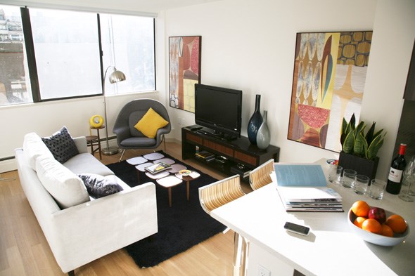
All 234 one-bedroom and studio suites feature porcelain-tile entryways, classic white-oak hardwood flooring, deep soaker tubs, Grohe faucets and fixtures and roller blackout shades for noise and light minimizing (yes, the suites are that bright!). Each suite feature was carefully selected in keeping with a West Coast Modern aesthetic.
Tenants also have access to secured storage lockers, bicycle lockers plus underground parking (there’ll also be a couple of Zipcars in the garage, too).
When deciding on amenities and the common areas, the PaPa team polled people through the “Imagine it at PaPa”
1. Resident guest suites to book for a reasonable rate (no more family and friends crashing on the couch or floor!).
2. A workshop for resident cyclists to repair and tune up bikes.
3. Artwork in the common areas that showcases local artists/photographers or highlights the history of area.
The Commons

Establishing an amenities area that tenants would actually use became a priority for PaPa’s developers, Austeville Properties—in keeping with its mandate of creating strong ties between residents, their neighbourhood and communities. Enter The Commons, a de facto community centre for PaPa residents.
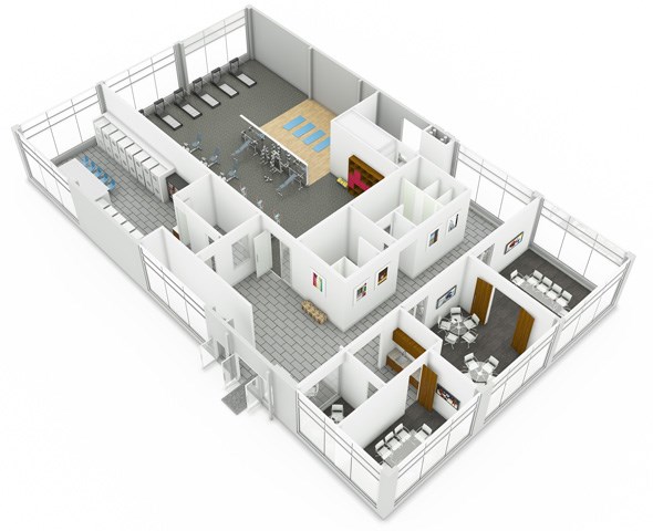
The Commons offers residents 6,000 sq ft of space, divided into three zones and featuring free WiFi:
1. Laundry Zone, a huge area situated on the main floor with natural light courtesy of the PaPa courtyard. With the Rolls Royce in eco-friendly laundry machines, your stylish garments are safe here!
2. Fitness Zone, an area that includes state-of-the-art fitness machines as well as a yoga space with mirrored walls and hardwood flooring. There are some pretty nifty views from the treadmills, too.
3. Meeting Zone, which features four meeting rooms and two shared kitchenettes—ideal for the growing entrepreneur and freelancers of the city.
Shoes on? Boxes already packed? Visit the for info on how you can “Come to PaPa.”
BONUS Q&A with PaPa design team, led by Hugh Cochlin and Kerri Shinkewski of

Q: Tell us about the design.
A: (Hugh) The building is designed in 50s Modernist “international style” which came out of the Bauhaus movement. The idea was a building style that could be done anywhere in the world, one that focused on form and function.
(Kerri) The idea is clean, simple lines—and recta-linear as much as possible. That way tenants have the ability to bring in their own style.
Q: What inspired you?
A: (Kerri) Taking 60s Modernist, but bringing it into today. Walls are white to keep things bright and give a neutral palette. We’ve used a fairly neutral gray-green in the kitchen without it being an overpowering colour.
Q: What about special accents?
A: (Kerri) The quartz-amalgam countertops in baths and kitchens are nice because they are a white with flecks, which lends glitz and texture, plus the white brightens things up. In terms of lighting, we worked with a designer to bring in LEDs and fluorescents in an interesting way. The LED pot lights (3” diameter) add a little sparkle in ceiling, plus keep power consumption down and costs low to renters.
Q: Your favourite feature?
A: (Kerri) The bathroom. We’ve put in a shallow counter—that floats—with a cantilevered sink. It hangs off the counter and maximizes the bathroom space.
A: (Hugh) All the faucets are Grohe. Everything is very high quality.
Q: How does the design support the sense of community at PaPa?
A: (Kerri) The amenities building. It is so impressive. It sets this place apart from any other rental building. It’s practically a community centre.?
A: (Hugh) Most tenants don’t use amenity rooms. This one, they will—because of its location. By putting it in a big pod with the yoga studio and gym, offices and party rooms, it’s like a community centre—not a dark room tucked into a corner. And by combining it with the laundry facility, you get the whole “I’m doing my laundry while working out” thing. The gym is large, well equipped and looks onto Alberni Street, so the view is out to the mountains. The office spaces provide opportunities for telecommuters to work here.
Q: What does success look like for this project?
A: (Hugh) Someone walking in and saying, “I can’t believe this is a rental!”


