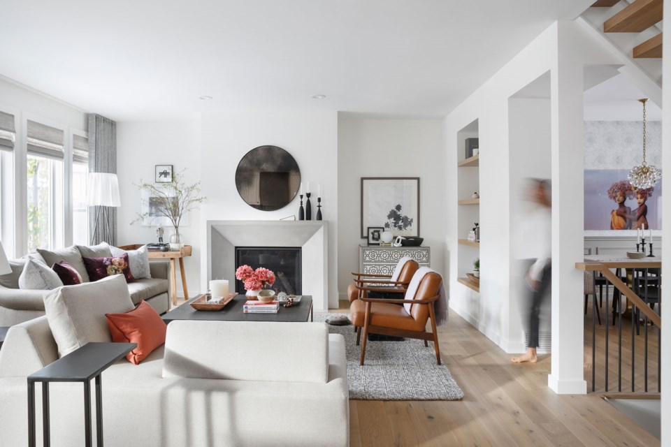
When Nyla Free, the principal designer and CCO of , first bought her house, she only planned to stay for two or three years before moving on.
But 15 years later, Free and her family remain settled in their home and neighbourhood. Rather than moving or building new, Free decided to give her home a fresh look and some timely updates to reflect her family’s tastes and everything they love.
As renovations began, Free homed in on the main bedroom. While Free says clients tend to leave the bedroom transformation for last, she believes it should be one of the first changes. Free wanted a complete refresh of the dark, outdated space to create a relaxed, calm feeling.
“Everyone deserves a sanctuary and a place to feel good about spending time in,” says Free.
To create that serenity, Free focused on brighter colours and modern updates. She replaced carpets with hardwood from , used soft dove greys and whites to paint the walls and ceiling, added a stylish medallion ceiling light and installed new blinds and drapery. Now, Free says the space is both visually aesthetic and mental and emotionally calming.
Bedroom, before.
Bedroom, after. Photo by Phil Crozier.
Just off the main bedroom is a bonus room that Free admits wasn’t being used to its full potential. Before the renovations, she jokes that her family would “put blinders on as [they] walked by” to avoid looking into the room, which had become a storage spot for unnecessary items.
Post-renovations, the now multifunctional room is bright, stylish and one of Free’s favourite spaces in her home. New hardwood flooring from Divine Flooring and a fresh coat of paint helped brighten the space, while new lighting fixtures and simple blinds created a more spacious feel. The carefully selected furniture is perfect for watching TV or quietly reading, and the room now doubles as a sleeping area as the sofa pulls out into a bed.
When Free first toured her home, she says the central, open riser stairs was one thing she was immediately drawn to. Free wanted the stairs to be a focal point from all sides, but the outdated design ruined the effect. So, she stripped everything down to the basic frame and started fresh. Free replaced the dark wood railings with light brown, removed the carpet and added hardwood and installed the spindles directly into the hardwood frames for a seamless appearance.
Now the bright, stylish stairs effortlessly complement the natural wood tones and touches of whites throughout the open main floor.
Stairs, before.
Stairs, after. Photo by Phil Crozier.
While most homeowners added home offices during the pandemic, Free chose the opposite approach. She took her existing home office and transformed it into a working pantry. “Appreciating your own lifestyle in the process of a renovation is critical in it being 100 per cent tailored to you,” says Free. She redesigned the kitchen to accommodate the passthrough pantry which opens into the kitchen. The spacious pantry now stores everything from dry food and small appliances to wine and more.
Free transformed her existing home office into a working pantry. Photo by Phil Crozier.
Kitchen, after. Photo by Phil Crozier.
In the end, Free unleashed the full creative potential in her home by adding modern elements, style and, most importantly, personal taste to every square foot.
“Design is not about what everyone else is doing,” says Free. “What’s right for one may not be right for the other, and that’s okay!”
Want to transform your own space? Visit to learn more.


