 Photo Credit: Ahmet Misirligul / Shutterstock
With retail e-commerce spend in Canada nearing $30B last year alone*, it’s no surprise that companies are starting to look at their online experiences as closely as they look at their physical stores.
In many cases, websites serve as the primary point of contact between a customer and a brand. With a continuous fight for our digital attention, site design and user experience can make or break our relationship with a company.
So, what makes for a great online customer experience? We're highlighting five local companies that have nailed it by designing their sites with us – their customers – in mind. Take a look at where they've succeeded and why we think their websites are a cut above the rest.
1. Lululemon
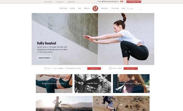
What Makes It Stand Out: Well-organized content, seasonal information, weekly updates
Not only does have a great , but they also pack plenty of interesting and useful content (hello, meditation how-to!) on their blog, community and education sections of the site that (gasp!) isn’t selling us anything at all. This Vancouver-born retailer keeps its web content fresh by updating it with seasonal information that truly brings Lululemon’s products to life in a compelling and visual way.
With great photos, succinct product descriptions and content updates made on the regular, their site has great visual impact, and by adding new clothes and accessories to the retail section of the site every week, they give us a reason to keep coming back – to shop – for more.
2. TELUS
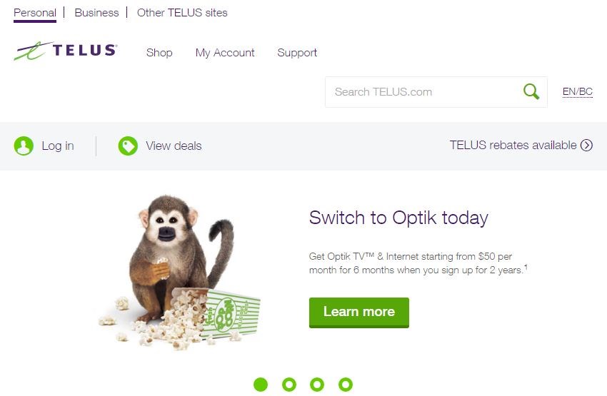
What Makes It Stand Out: very clean and easy to use, quick and effective online customer support
With a motto of putting customers first, ' site design walks the talk since the company redesigned its website after meeting with customers – face-to-face and online to find out what they want from their mobile service provider’s website.
As a result, the site is clean and uncluttered; first-time visitors looking to switch to this friendly telco can easily find information about a particular product or service, while current customers can easily access their account to check their bills or change their plans, or get online support through chat or social media. You can even upgrade your phone online in 5 minutes or less! Read more about the efforts that TELUS makes to ensure the site delivers what their customers need .
Do you have ideas you want to share about your TELUS service? The is an open forum created to help make it easy to share your thoughts and ideas with other customers.
3. Herschel Supply Co.
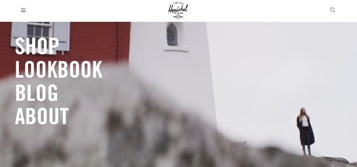
What Makes It Stand Out: Great aesthetics and design, cool factor
As an accessories and apparel company, Herschel Supply Co.'s is visually striking and memorable – and who doesn’t like visiting a beautiful site? Herschel’s site design is heavy on the use of high definition images and the main navigation is presented as bold text over a video montage. Talk about aesthetically appealing!
While the online shop and lookbook are the most popular visitor destinations, Herschel also highlights its latest blog and Instagram content too, which we can see right from the homepage.
4. Indochino
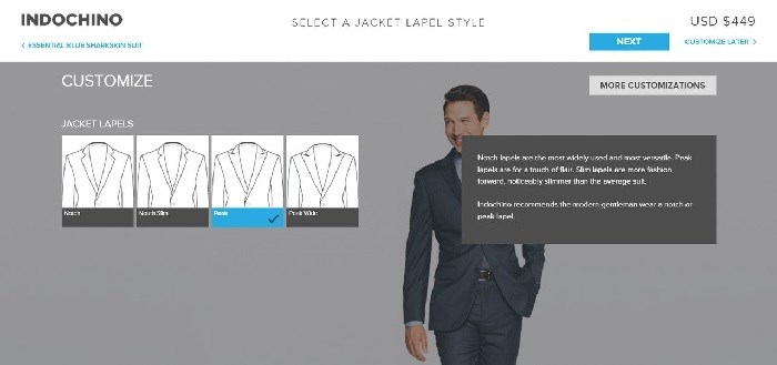
What Makes It Stand Out: Interactive elements, ability to really customize your purchase
At first glance, and online shop seems no different than that of most other e-commerce retailers. But when you look deeper, you realize that you can buy a complete, customized suit made-to-order from your laptop, tablet or mobile.
From lapel styles and pant cuffs, to embroidery options and a wide selection of materials, this company perfectly marries convenience and customization!
5. Fluevog Shoes
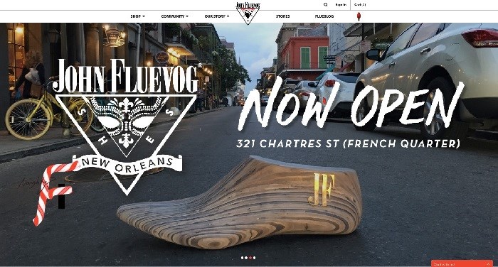
What Makes It Stand Out: True to brand, fun and stylish with an offbeat vibe
Fluevog shoes, like the veteran �鶹��ýӳ��shoemaker and fashion icon himself, are equal parts classy and unconventional. The showcases these values nicely, and gives the customer plenty of choices while keeping everything visually appealing and straightforward. The What’s New bar allows for easy browsing of hot new Fluevog offerings, from boots to bags to accessories, while the latest posts from the are presented as a series of photo cards, maintaining a clean look and keeping Fluevog style front and centre.
Bonus points for the , which takes customers on a deep and informative dive into the history of this homegrown success story.
At the end of the day, a great website can make all the difference to a company’s customers; we’re giving a virtual high five to these �鶹��ýӳ��brands that are raising the bar for online service.
* – Source:


