Company logos are often one of the most recognizable parts of a company's branding message, up there with slogans and spokespeople. The Nike Swoosh seems almost as familiar to some consumers as a beloved cartoon character, synonymous with a favourite product or experience. Logos can signify a product to consumers with no need to convey any other additional information like a sales pitch or photograph.
With that in mind, rounded up 50 iconic company logos and took a look at how they've changed over time. While changing a logo may not affect a company's core business or offerings, it can definitely affect the way consumers see them and how easily they're recognized.
While most logos are updated to keep up with the times and trends, logos can also change or be discontinued because of controversy. In response to a wave of protests following the death of George Floyd, in their brands. Quaker Oats planned to no longer use its 130-year-old Aunt Jemima name or logo, while Mars said it would change its Uncle Ben's branding—although the company stopped short of providing specifics at the time.
A 2015 Nielsen study found that nearly six out of 10 . Rob Wengel, the managing director of Nielsen Innovation in the U.S., said In the introduction to the study that known brands "can signify quality and inspire confidence." Whether it's a fast-food meal, plane ticket, or new car, Americans prefer to buy from a company they recognize and even admire—and a well-known logo can be one of the easiest ways to identify a familiar brand.
From Nike to Wendy's, read on to find out which company logos have gone under major redesigns and why.
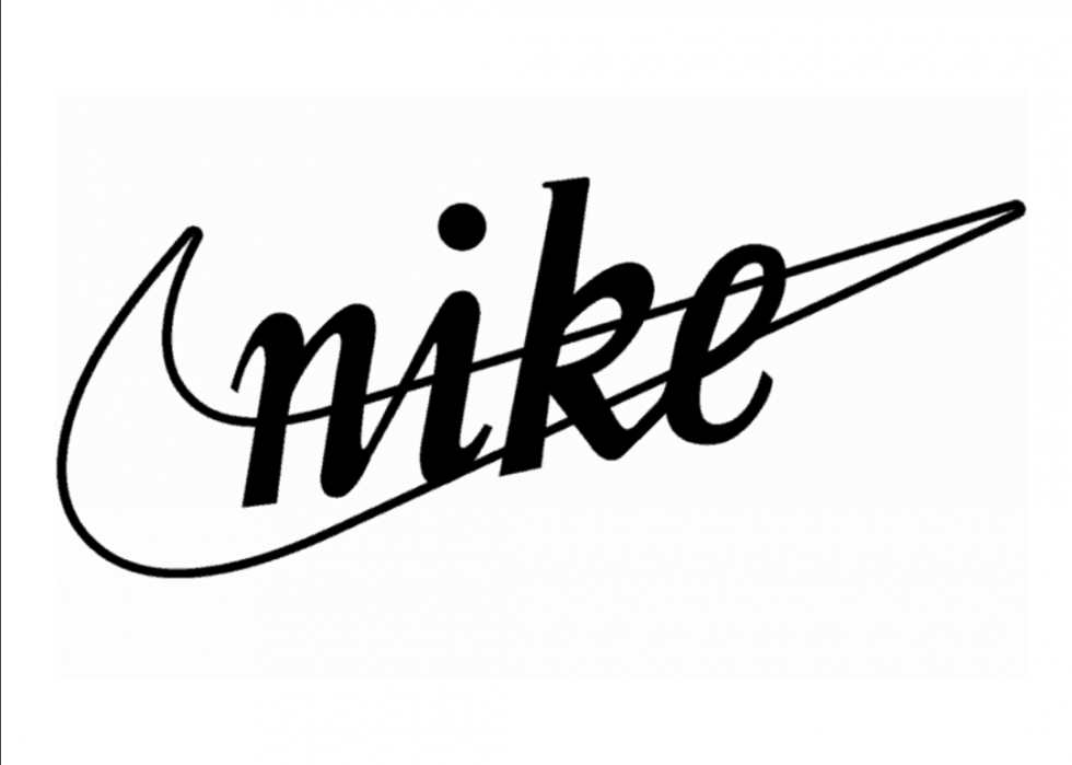
Nike: then
Originally founded in 1964 by Bill Bowerman and Phil Knight as Blue Ribbon Sports, they renamed the company Nike Inc. in 1971. Named after the Greek goddess of victory, the label is famous for its waffle-soled running shoes, which were originally made on a waffle iron. Portland State University student Carolyn Davidson, who was paid $35 (approximately $200 today), designed the original logo.
Nike: now
Never quite sold on the original logo, Phil Knight dropped the company's name from the logo altogether in 1995. Today the lone swoosh is one of the most recognizable logos in the world, fitting for a company that reportedly sells 25 pairs of sneakers a second.
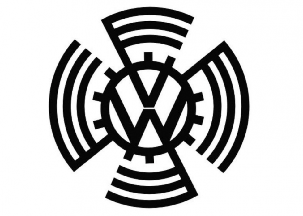
Volkswagen: then
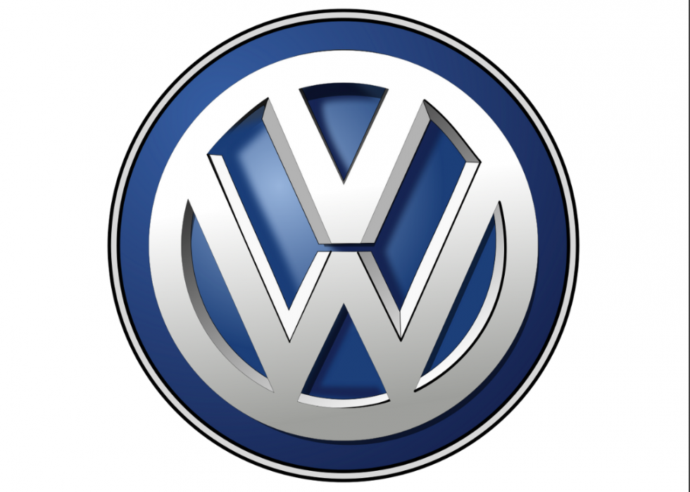
Currently the second-largest car maker in the world, Volkswagen was founded in 1937 by a Nazi trade union organization to create an automobile that every German family could own. The original logo was designed to mirror a swastika or the now infamous Nazi symbol.
Volkswagen: now
Harkening back to its Nazi origins would not do for a carmaker in today's world. The current logo was designed in 2000 and has done away with all the swastika-like arms. A simple blue and white colour scheme was intended to elicit feelings of class, excellence, and reliability from consumers.
IBM: then
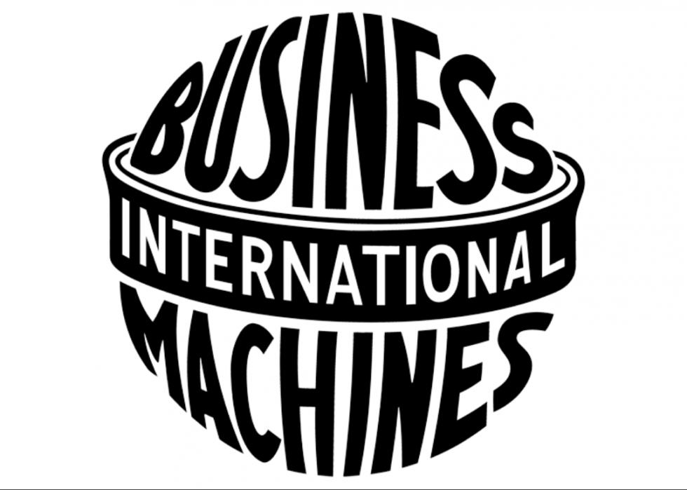
After three separate companies were merged in 1911, IBM was established as the Computing-Tabulating-Recording company. In 1924 the company was renamed International Business Machines. Their original logo was intended to illustrate their vision for futuristic designs and their intention to go global.
IBM: now
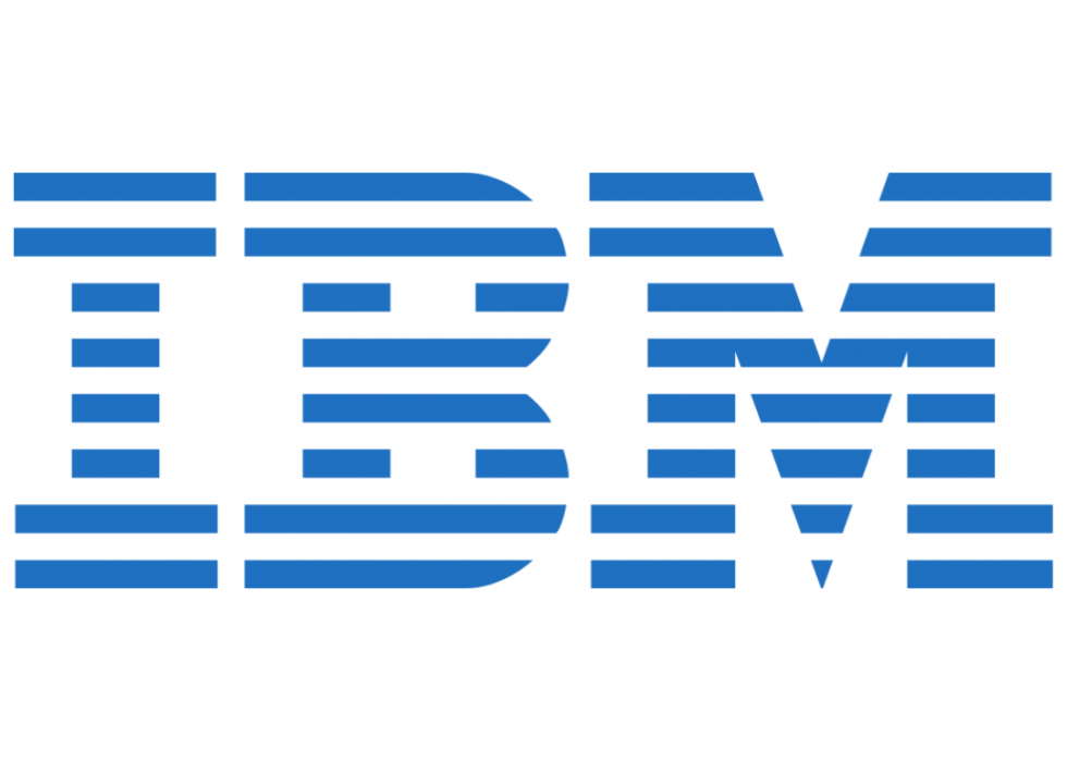
IBM's current logo, designed by Paul Rand in 1972, made the company more modern and increase its appeal to customers. Valued at $32.1 billion as of 2018, the company has certainly succeeded in appealing to an ever-widening consumer base.
AT&T: then
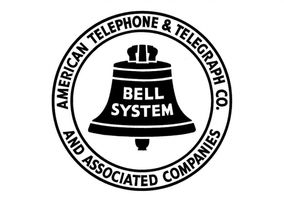
Begun by Alexander Graham Bell in tandem with his invention of the telephone in 1877, AT&T (or Ma Bell) had a monopoly on the telecommunications industry until a civil antitrust suit forced the company to split up in 1984. The bell in the original logo is a nod to the company's founder.
AT&T: now
The globe logo, designed by Saul Bass, was introduced in 1983, just after AT&T split into several "baby bell" companies. The logo was later given a facelift which included making the globe 3D to represent the breadth and depth of services the company was once again providing.
Pepsi: then
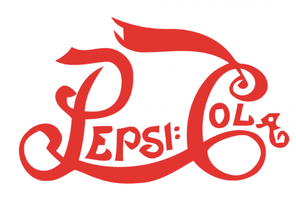
Caleb Bradham invented Pepsi-Cola in 1893, selling the soft drink—originally marketed as a digestive aid—in his North Carolina pharmacy. The company's first logo, a swirly red script, was introduced in 1898 and closely resembles the Coca-Cola logo.
Pepsi: now
Having undergone over a dozen iterations in the 126 years of company history, the current Pepsi logo was unveiled in 2014. The red, white, and blue ball is a hyper-minimized version of an old-school bottle cap, and the thin, lower-case font keeps the century-old beverage modern.
Starbucks: then
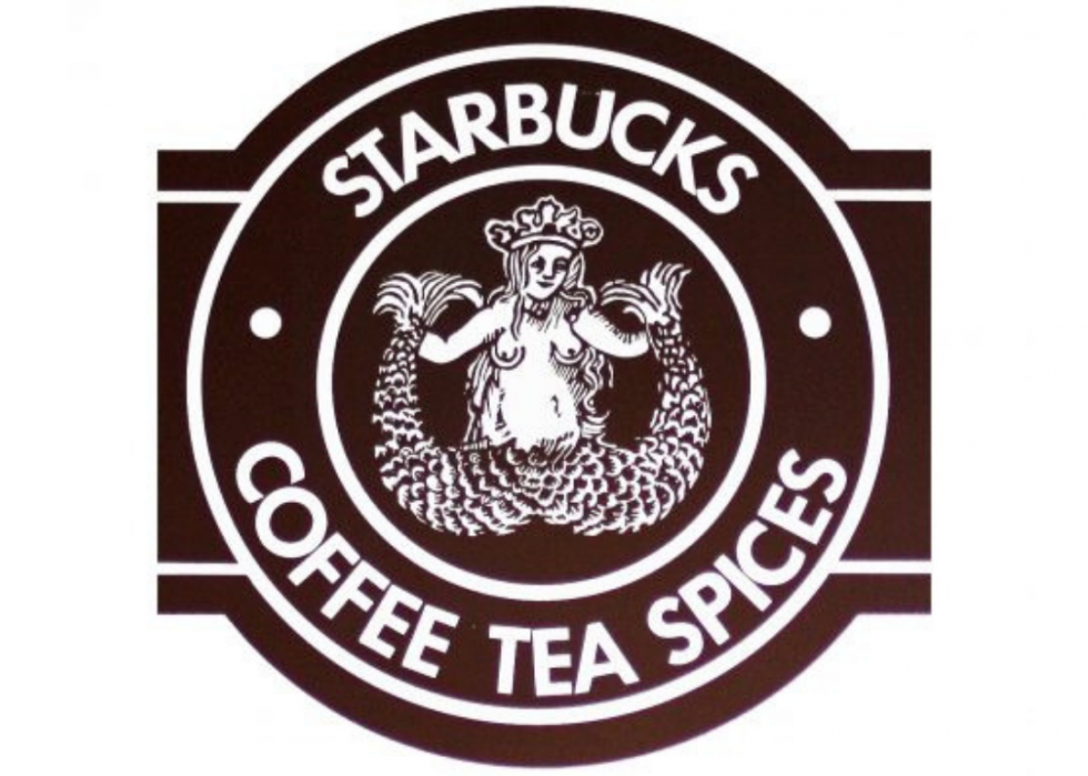
A relatively new company, the first Starbucks opened in 1971 at Seattle's Pike Place Market. The company was named after an obscure literary character (Capt. Ahab's first mate, Starbuck, in "Moby Dick"), and the original logo continues this seafaring theme. An image of a Siren from a 16th-century Nordic woodcut would have adorned takeaway cups in early years.
Starbucks: now
As of 2018, there were 29,324 Starbucks stores in 50 countries around the world. The logo has become increasingly more modest over the years (gone is the siren's bare chest), and the iconic green was introduced in 1987. The brand's current logo was introduced in 2011 to celebrate Starbucks' 40th anniversary.
FedEx: then
In 1965, Yale undergraduate Fred Smith wrote a term paper about the challenges in making urgent, time-sensitive deliveries. In 1971, he founded Federal Express Corp. in Little Rock, Ark., and during the company's first day of business 14 jets were used to deliver 186 packages overnight to 25 U.S. cities, changing the shipping industry forever. The original logo, using the "federal" and written in red, white, and blue, was intended to associate the company with the government, giving it an air of authority.
FedEx: now
The current logo is only the company's second. It made its debut in 1994 and is famous for the optical illusion hidden inside it; the space between the connected E and X creates a small arrow, symbolizing the speed and accuracy of the deliveries.
Microsoft: then
Childhood friends Paul Allen and Bill Gates founded Microsoft in 1975. They released Windows in 1983, Microsoft Office in 1989, and Internet Explorer 1.0 in 1995. While not the company's first logo, the "Pacman logo" by Scott Baker was introduced in 1987 and became an instant classic.
Microsoft: now
In 2012, 25 years after its previous update, Microsoft unveiled its current logo with a ribbon-cutting ceremony in a Boston store. The symbol's four coloured squares are intended to represent the company's diverse array of products.
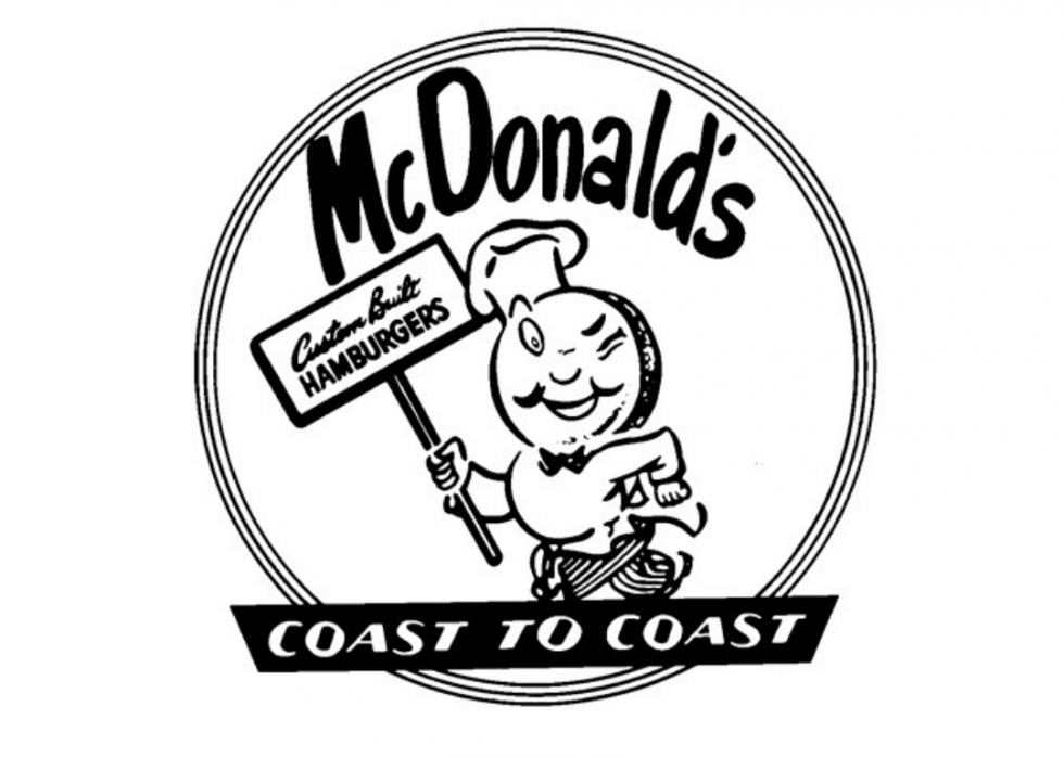
McDonald's: then
Brothers Richard and Maurice McDonald opened their first drive-in restaurant in San Bernardino, Calif., in 1940, selling barbecued meat sandwiches and french fries for 35 cents. After World War II the brothers revamped their menu, choosing to focus on the hamburgers and cheeseburgers that had become their bestsellers. The winking, running chef from McDonald's 1948 logo was intended to represent the fast service customers would find at any of the growing numbers of restaurants.
McDonald's: now
The iconic golden arches first debuted in 1961. The appearance of today's sleek and simple logo on restaurants around the world shows how successful the company has become—there are 36,000 McDonald's restaurants in 101 countries around the world that serve 69 million customers each day.
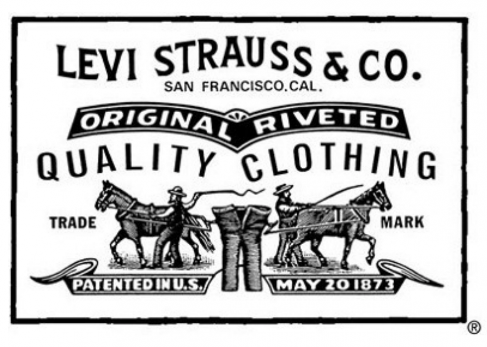
Levi's: then
Levi Strauss opened his dry goods wholesale business, Levi Strauss & Co., in 1853. 20 years later he patented the blue jean and changed the focus of his company. The original logo which first appeared in 1886, featured two horses attempting to pull apart a pair of Levi's blue jeans, symbolizing both the strength of the pants and the strength of the company in the face of competition.
Levi's: now
The now iconic "batwing" logo that appears on the back pocket of every pair of Levi's jeans came on to the scene in 1967. At the time, the brand was focused on refreshing its image, and the new logo—designed by Walter Landor and Associates—was meant to convey a "youthful but timeless" feel.
Visa: then
Most people carry at least one credit card in their wallet today, but in 1958 the concept was brand new when Bank of America launched its BankAmericard, a paper credit card with a $300 limit. In 1976, the BankAmericard name was changed to Visa, in an attempt to simplify the name for global customers. The blue and gold in the original logo were meant to represent the blue skies and golden hills of California, where Bank of America was based.
Visa: now
Visa has been slowly getting rid of the gold in its logo for years; each iteration has less of the Pantone 1375 colour. Their current logo is the first version to be entirely blue, eliminating the idea that credit cards are just for the wealthy (or those with at least a bit of gold in their bank accounts).
Canon: then
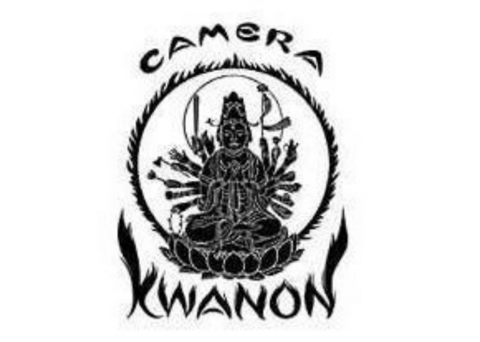
Officially established in 1933, Canon produced its first camera prototype, the Kwanon, a year later in 1934. Named after the Buddhist goddess of mercy—Kwanon—the original, engraved logo featured a picture of the goddess and her thousand arms surrounded by flames.
Canon: now
The current logo was designed in 1956. Simply featuring the name of the company in a bright, eye-catching red, the logo represents the aim of the company: "to set a global standard for advanced technologies."
Audi: then
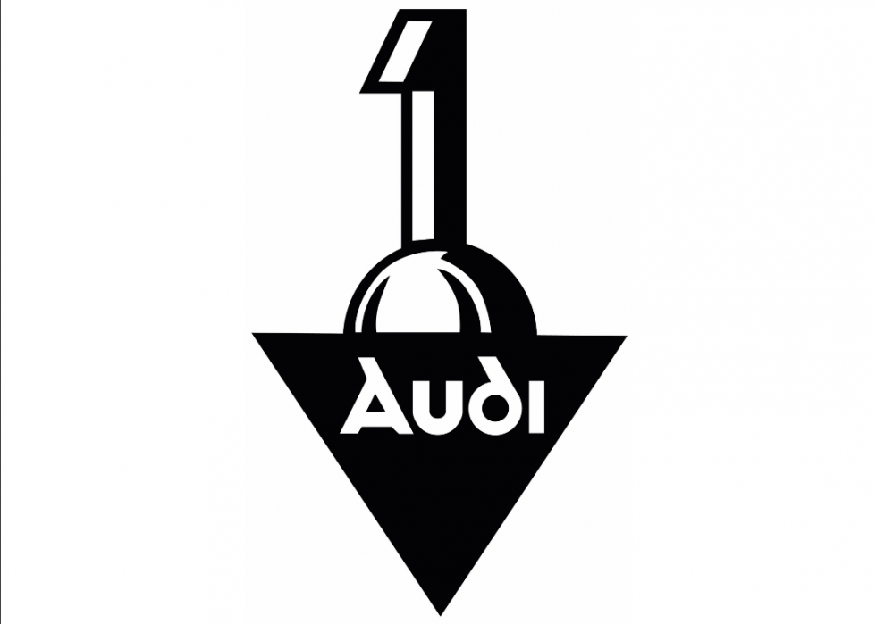
In 1910 a brand-new luxury car maker, Audi Automobilwerke GmbH Zwickau, stepped onto the scene unveiling its first automobile, the Audi Type A Sport-Phaeton. The original logo prominently featured the Audi name and a giant #1, reminding consumers which car company truly was the best.
Audi: now
The current four interlocking rings logo came about in 1928. After four Audi competitors (Rasmussen's DKW, Wanderer and Horch) merged with Audi to form the Auto Union in 1932, the logo was changed to recognize the companies' equal and connected fates.
Firefox: then
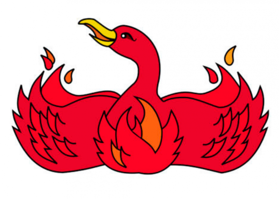
Mozilla Firefox, a web browsing application, was released in 2002. The original logo represented the fact that the browser had first been called Phoenix and had only changed its name after a trademark dispute.
Firefox: now
The current logo was released in 2003 after the company lost its court case to keep the name Phoenix. The Firefox logo is meant to symbolize the company's blazing speed and global reach. However, Mozilla recently announced that it's changing the logo once again, asking for users to submit their feedback on the design choice.
Playboy: then
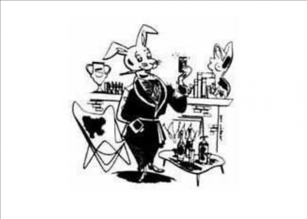
In 1951, after being denied a $5 raise, Hugh Hefner quit his job as an Esquire copywriter and started his own magazine, Playboy. A near-instant success, the magazine has sold millions of copies and has spawned an entire brand, spinning off into everything from nightclubs to television shows. The original logo, a more detailed version of the rabbit in a smoking jacket, was drawn by Art Paul in 1953.
Playboy: now
While Hefner liked the original, detailed sketch of the rabbit, a simpler version was needed for branding purposes. Art Paul's toned-down version of the logo appeared on the second issue of the magazine and has remained on the cover of every issue since.
Amazon: then
Jeff Bezos, the world's richest man, launched Amazon out of his garage in 1995. Originally, the website only sold books, and its first logo prominently featured one of the world's biggest rivers, pairing perfectly with the retailers' claim to be "Earth's biggest bookstore."
Amazon: now
When Amazon began to expand its inventory, a new logo became a necessity. Simply the web address with a yellow arrow linking the A and Z—which illustrates how a customer could find anything they were looking for, from A to Z, on the website—the logo now ranks .
LEGO: then
LEGO is an abbreviation of two Danish words "leg" and "godt" meaning "play well." Launched in 1932, the company originally created wooden toys before introducing its legendary Lego brick in 1958.
LEGO: now
When LEGO began production in the United States in 1973, the company also unveiled a new logo. The classic red, yellow, and white logo was meant to grab consumers' attention and showcase the bright colours of their creative toy.
Verizon: then
Born in 2000 with the merger of Bell Atlantic Corp. and GTE Corp., Verizon quickly became a technology leader. Today, the company is the leading mobile phone carrier, holding nearly 35% of the market.
Verizon: now
When Verizon acquired AOL in 2015, they also acquired a new logo. Simpler and cleaner than before, the logo still prominently features a red check mark which Verizon sees as the "universal symbol for getting things done."
Shell: then
Shell started out as an antique and oriental shell company in 1833. Today they're one of the biggest energy companies in the world, thanks, in large part, to the import/export systems they'd built. The original logo, a highly realistic Pecten shell, was a nod to the initial product.
Shell: now
When Shell first began building service stations in California in 1915, they found a need for a more commercial logo. So the company switched to a brighter, more cartoonish version of their now-famous Pecten shell. The colours red and yellow were chosen because of California's close connections to Spain.
Yahoo!: then
Stanford undergraduate students Jerry Yang and David Filo began Yahoo! as a hobby in 1994. Their side project became the biggest internet company on the planet, once valued at $125 billion. They eventually succumbed to unrelenting competition, selling to Verizon for less than $5 billion in 2016.
Yahoo!: now
In 2013, three years before selling off their core business, Yahoo! rebranded in an effort to regain its position at the top of the tech industry. Keeping the trademark purple colour, the sleeker lettering was intended to have a more modern and innovative feel.
Delta: then
Delta Airlines has origins as the first commercial agricultural flying company. In 1929, they operated their first commercial passenger flight from Dallas, Texas, to Jackson, Miss. An early logo from 1934 features the triangular Greek letter "delta" in patriotic colours.
Delta: now
Today's logo still features a stylized version of the Greek letter, referred to inside the company as a "widget." Unveiled in 2007, the current logo reflects Delta's transformation into "a highly differentiated, customer-focused airline."
Apple: then
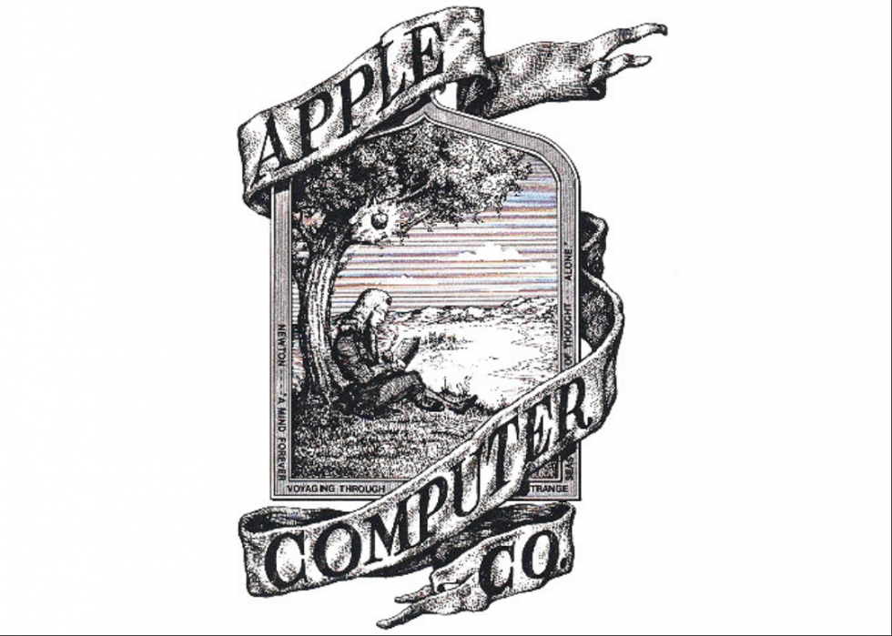
Apple was founded in 1976 by Steve Jobs and Steve Wozniak, in Jobs' garage. Their Apple II computer, which was released in 1978, revolutionized the computer industry. And the rest, as they say, is history. The company's original logo was a pen ink drawing of Isaac Newton sitting under an apple tree, about to discover gravity.
Apple: now
The Isaac Newton logo only lasted a short time—by the end of the company's first full year in business, the half-eaten apple had fully replaced it. From 1976 to today, the logo itself hasn't changed (except for various experiments with colour and monochrome).
GE: then
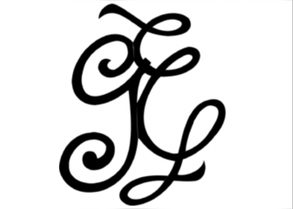
In 1890, Edison General Electric company was formed by none other than Thomas Edison, the inventor of the light bulb. In 1892 it merged with its competitor, the Thomson-Houston Company, to become General Electric, the biggest electric company in the world.
GE: now
The modern GE logo contains the same monogram as the original logo, albeit in a slightly more stylized font. The added circle represents the company's worldwide presence, and the added blue background serves to make it a more memorable and eye-catching trademark.
Adidas: then
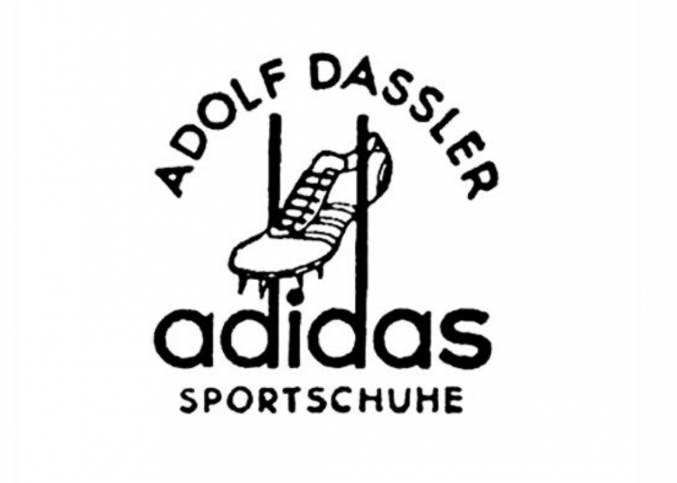
Adolf Dassler began his shoe company, Dassler Shoes, in his mother's washroom after his return from World War I (Dassler fought for the Germans and later joined the Nazi party). In 1936, he drove to the Olympic Games with a suitcase full of his shoes in tow and convinced Jesse Owens to compete wearing his spikes. Then, in 1947, he changed the name of his popular sports brand to Adidas, a combination of his nickname, "Adi," and his last name.
Adidas: now
When Adidas branched into apparel in 1971, the company switched from its original shoe logo to the famous trefoil. In 1997, the three bars (rotated 30 degrees to resemble a mountain) made their debut. Finally, in 2005 the three bars were boiled down into the brand's most simplistic and iconic form yet.
NASA: then
The Soviets launched Sputnik I in 1957; a year later, as a direct response to the perceived technological gap, . The agency's first logo and official seal were created by a Lewis Research Center illustrator.
NASA: now
The current logo was created by the then-head of Lewis' Research Reports Division, James Modarelli. A simpler take on the official seal, it features a white orbital path and a red airfoil, representing NASA's various specialties. The logo is often referred to as "the meatball" by NASA employees.
Burger King: then
The first Insta-Burger King opened in Jacksonville, Fla., in 1953. By 1959, the flailing company was bought out and restructured, and by 1961 Burger Kings were open throughout the country. The chain's original logo, a stylized sun, focused heavily on the company's Florida origins.
Burger King: now
Now the second-largest burger chain behind McDonald's, Burger King's logo has undergone quite a transformation since those early days of bankruptcy. In 1969, the company debuted its first burger-shaped logo, with two golden buns and the company name acting as the patty. In 1999, the logo was updated to its current form: brighter, lighter, and slightly tilted.
Adobe: then
John Warnock and Charles Geschke formed Adobe Systems in 1982. Their most well-known program, Adobe Illustrator, was released five years later in 1987. Marva Warnock, Warnock's wife, worked as a graphic designer and designed the company's first logo.
Adobe: now
In 1990, the logo got an update. Keeping the "A" from the original design, a flashy red background was added, and the company's entire name was tacked on underneath. The clean and simple approach is meant to convey the simple, user-friendly interface of all Adobe products.
United Airlines: then
United Airlines made its first flight from Pasco, Wash. to Boise, Idaho, in 1926. The United Airlines tulip logo was designed in 1973 and was so beloved that a Facebook campaign to keep it was launched when United announced its retirement in 2010.
United Airlines: now
After a merger with Continental Airlines, United launched its new logo: Continental's globe with United's name. Clean, simple, and easily recognized from the ground, the new logo highlights the merger of the two air giants.
3M: then
Five people founded Minnesota Mining and Manufacturing Company in 1902. By 1914, they had their first exclusive product: the 3M Three-Mite Abrasive Cloth. Today, 3M has over 60,000 exclusive products that are sold in 200 countries around the world.
3M: now
3M has had dozens of logos over the last 100 years. The current design, which was first used in 1978, is a bright red 3M, reflecting a desire for something simple and memorable.
Target: then
Dayton Dry Goods Company opened its doors in Minneapolis, Minn., in 1902. It would remain in the family—and under that name—until 1962 when the first Target, a discount department store, was spun off from the original business. The bullseye logo made its debut the same year, chosen because "a marksman's goal is to hit the center bullseye," reflecting the goal for their consumer experience.
Target: now
In 1968, Target dropped its name from the logo, opting to keep just the bullseye. As the company expanded across the country (as of 2009 there were Targets in all 50 states), it sought a more direct, memorable, and poignant symbol.
Ford: then
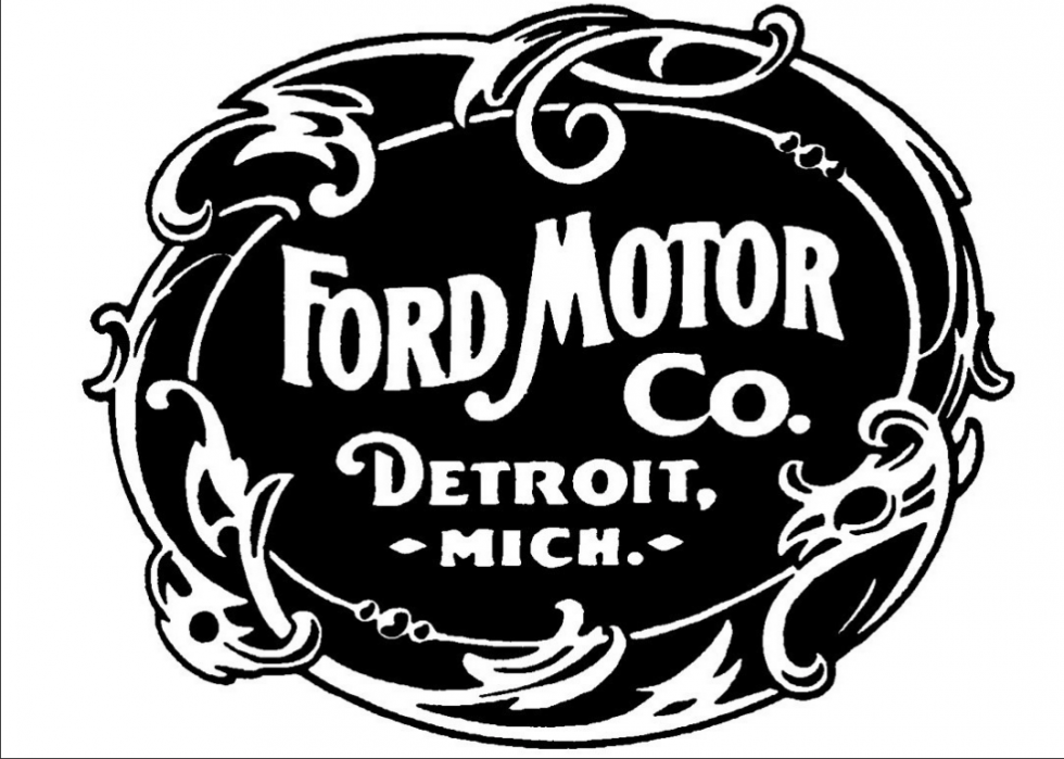
The Ford Motor Company was incorporated in 1903. By the time it sold the first Model A, the company had spent nearly all the $28,000 the company had in the bank. A mere three months later, they'd turned a profit of $37,000.
Ford: now
Ford's first chief engineer/designer, Childe Harold Wills, used the calligraphy from his personal business card to design the signature-like logo in 1907. In 1912, the oval was added, and in 2003—to celebrate the company's 100th year in business—it was updated with brighter coluors and 3D shading.
WWF/E: then
The World Wide Wrestling Federation was officially founded in 1963, but it wasn't until Vincent McMahon bought his father out in 1982 that the WWF/E became what we know it to be today. McMahon consolidated many smaller professional wrestling companies around the country to build the first national company, shaking up the industry along the way by doing things like announcing that the winner of each match was predetermined.
WWF/E: now
In 2002 the company became World Wrestling Entertainment, dropping the "federation" entirely. The current logo reflects the change and is also linked to the 2014 debut of the WWE Network.
WWF: then
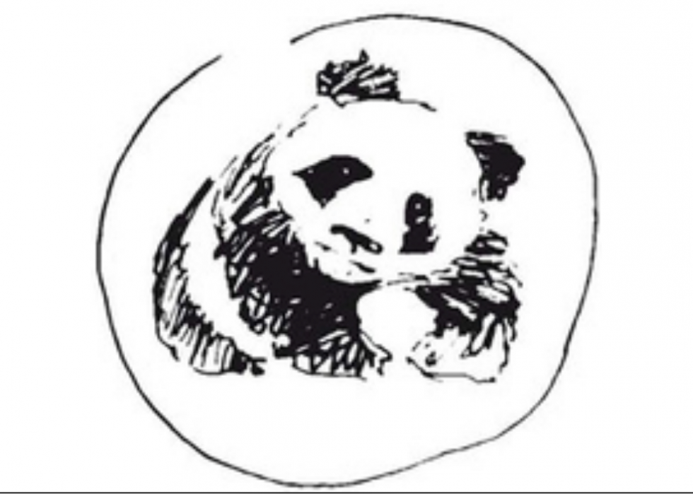
Addressing the need for an organization that would protect the world's environment, several conservationist groups came together to form the World Wildlife Fund (WWF) in 1961. The same year a giant panda arrived at the London Zoo. She seemed like an obvious choice for the conservationist group's logo, and founder Sir Peter Scott set out to create a sketch of the endangered animal that could be used.
WWF: now
In 1986 the current, cleaner logo—which forces the viewer to fill in the gaps in order to finish the picture—was unveiled. According to the design company, their working attributes were: not too cuddly, not too ferocious, and most certainly not about to go extinct.
Google: then
Now the most visited website in the world, Google had humble beginnings. Registered in 1997 by Larry Page and Sergey Brin, the company's first office was a friend's garage, and the two founders attempted to sell their project in 1999 in order to focus on their graduate studies. They weren't able to find buyers, and not much later—in the early 2000s—things really took off for the internet giant.
Google: now
Since those early days, has only changed in the details. The colour order has been switched up; the letters have gone flat, and in 2015 a brand-new, in-house designed font replaced the classic Catull.
Coca-Cola: then
Much like Pepsi, Coca-Cola was developed by a pharmacist, Dr. John S. Pemberton, who sold the concoction at his soda fountain. In 1886, a serving of Coca-Cola cost five cents, and they sold a mere nine servings each day. Today, 1.9 billion servings of the soft drink are sold around the world each day.
Coca-Cola: now
Frank Robinson, Pemberton's bookkeeper, not only thought of the name for the fizzy beverage, he also provided the script in 1887 that the brand still uses today. Aside from temporary alterations, like a celebratory 125th birthday design, the Coca-Cola logo remains relatively unchanged today.
Warner Bros.: then
In 1903 the Warner brothers—Albert, Sam, Harry, and Jack—struck out in the film business as travelling exhibitors. By 1918, they had released their own full-scale movie called "My Year in Germany" which grossed $1.5 million, and they used some profits to open the Warner Bros. West Coast Studio. The company's original logo , Calif., studios.
Warner Bros.: now
The WB shield used by the studio today first appeared before a motion picture back in 1925. However, Warner Bros. encourages filmmakers to tailor their logo to suit the tone of their films. As a result, there have been of the logo over the last 15 years alone.
Instagram: then
After eight weeks of hard work, Kevin Systrom and Mike Krieger launched Instagram in October 2010. On its first day, Instagram became the top free photo sharing app with 25,000 users. By March 2012 (a mere year and a half later), Instagram had 27 million users and was acquired by Facebook for $1 billion.
Instagram: now
In 2016, Instagram revealed a new, more abstract icon. The old skeuomorphic icon is more instantly recognizable as a camera, but its current logo fits in better with other smartphone app icons and allows Instagram to still feel new, fresh, and inspiring.
American Airlines: then
In 1930, 80 small and independent air carriers merged to form American Airways Inc. Four years later, the company changed its name to American Airlines, and in 1936 their first commercial flight from Chicago to New York City was completed.
American Airlines: now
It's not surprising that an airline with a name as patriotic as American Airlines would choose to use both the United States' national colours and national bird as pieces of their logo. When the company announced a merger with US Airways Group in 2013, they simultaneously announced a new emblem design. The red, white, and blue eagle remains, but the brand's name has been dropped from most aspects of the branding.
Mercedes: then
Karl Benz, the creator of the first ever automobile, and Gottlieb Daimler—inventor of the high-speed petrol engine—were competitors back in 1886 when both companies were just getting off of the ground. However, by 1926 the two companies had merged, and a year later the first Mercedes-Benz vehicle hit the streets.
Mercedes: now
First used in 1909, the three-point star represents the company's domination of earth, land, and sea. The silver colour of the star represents the company's involvement in the first Grand Prix in 1934 (the car was dubbed "the silver arrow").
Airbnb: then
In 2007, Joe Gebbia and Brian Chesky couldn't afford to pay their rent. So when a huge designer conference was set to take place in San Francisco, they rented out some extra space in their apartment to cover the gap. Realizing they'd struck on a great idea, they talked their former roommate Nathan Blecharczyk into joining them and officially launched Airbnb in 2008 at the Democratic National Convention in Denver, Colo.
Airbnb: now
In 2014, the company rolled out its new logo. The Belo, as they dubbed it, is intended to be a symbol of belonging. Airbnb's goal has always been to ensure travellers felt at home anywhere in the world, aiming to make customers feel they belong in these cities instead of just visiting them.
Chevrolet: then
William Durant founded the Chevrolet Motor Company in 1911, naming it after his financial partner, the legendary race car driver Louis Chevrolet. Durant's mission was to provide cars that were made and priced for the general population, and by 1917 he'd created the first Chevy truck. 1953 saw the addition of one of the brand's most popular vehicles to date: the Chevrolet Corvette.
Chevrolet: now
There are several origin stories for the Chevrolet bowtie logo. The one told most often by founder William Durant was that he saw the design on the wallpaper of his hotel room in Paris and liked it so much that he tore off a section to bring home, thinking that it would also make a good design for the nameplate of a car. Regardless of where it came from, the bowtie has been in use since 1913. In 2004, the bowtie turned to gold to reflect the idea that Chevy cars and trucks were the "gold standard" of the automobile industry.
Heinz: then
One of eight children born to German immigrants, Henry J. Heinz began bottling and selling his homemade horseradish in 1869. It didn't take long for his first company to go bankrupt, but ever the entrepreneur, Heinz set out to try again. In 1876 he started the F & J Heinz Co., which now sells over 650 million bottles of tomato ketchup each year (and other products like baked beans, mayonnaise, and mustard).
Heinz: now
The Heinz logo does a fantastic job of pointing consumers back to the organization's beginnings. The shape, a keystone, is a nod to the fact that the brand is headquartered in Pennsylvania, the Keystone state. And as the company's offerings have expanded, the keystone was changed from white to Heinz Red, as a nod to the company's first product and the ripe tomatoes used to make it.
Sony: then
Japanese company Sony was founded in 1946 by two businessmen, Masaru Ibuka and Akio Morita. With only 200,000 yen in their pockets (equivalent to about $1,500), they got straight to work and released their first product, a power megaphone, less than a year later. From the Walkman to the OLED TV, Sony has become one of the biggest and most well-known electronics companies on the market.
Sony: now
Sony is a combination of the Latin word Sonus, which means sound, and the phrase "Sonny Boy," which was widely used in Japan back in the 1950s to describe a young person with a free and entrepreneurial spirit. The typeface was smoothed out and simplified as Sony products began to go global. The current logo was first used in 1973 and doesn't seem to be going anywhere despite several proposals for new branding.
Xerox: then
Beginning as a small photography paper business in Rochester, N.Y., in 1906, Xerox spent the next century establishing its reputation as one of the biggest information technology companies in the industry. In 1946, the company introduced its first copier, the Xerox, and in 1973 the first personal computer was built at the newly minted Xerox Palo Alto Research Center.
Xerox: now
In 2008, long after the company name had become a verb, Xerox released its current logo. The new logo features a sphere that represents the company's connection to its customers, partners, industry, and innovations. It's also dropped all reference to Xerox being "the copier company" or "the document company," illustrating the fact that Xerox now does so much more than just those things.
KFC: then
Harland Sanders became a professional chef at 40, and by the age of 63 he had over 600 franchise locations across the country selling his famous Kentucky Fried Chicken. By the age of 75, he'd sold his franchising rights in return for a lifetime salary and a position as the brand's ambassador. Dubbed a colonel by the governor of Kentucky in 1950, Sanders spent the rest of his life travelling upwards of 250,000 miles each year visiting restaurant locations and making media appearances.
KFC: now
The original KFC logo was dreamt up by a design agency in 1952, using both the company's full name and a caricature of Harland Sanders himself. While the colonel has remained an integral part of the company's branding, the word "fried" was dropped from the logo (the agency opted for the KFC abbreviation instead) in 1991 in an effort to make the menu seem healthier. The current logo resembles the buckets that larger orders of chicken are served in.
Southwest: then
Southwest Airlines was founded in 1971 as a regional airline that served only Dallas, Houston, and San Antonio. However, by 1998 Southwest was the fifth largest airline, carrying over 50 million passengers each year. They've since taken over other smaller airlines, including TranStar Airlines and Morris Airlines, increasing the number of routes they fly and the number of customers they can serve.
Southwest: now
The airline's home airport back in 1971 was Dallas Love Field. Southwest's new logo, a love heart, which they began using in 2014, symbolizes the company's commitment to remain committed to their core, empathetic values.
Fiat: then
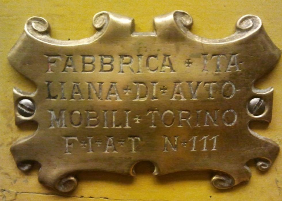
The first Fiat factory opened in Turin, Italy in 1900, and in the company's first year it completed 24 cars. The original logo spells out the company's full name, Fabbrica Italiana Automobili Torino, with an empty space after the N for the serial production number.
Fiat: now
A reprisal of a logo used throughout the '50s, Fiat's current emblem was introduced in 2006. Celebrating the fact that the company made it through one of the worst financial recessions of all time relatively unscathed, and harkening back to the glory days of the '50s, the logo is a celebration of all that's to come for the company as well as a remembrance of all they've been through.
Nintendo: then
In 1889, a small Japanese company selling Hanafuda cards burst onto the scene. Located in Kyoto and started by Fusajiro Yamauchi, the company quickly gained popularity. When Yamauchi's grandson, Hiroshi, took over in the early 1950s, Nintendo added toys to its repertoire. In 1975, Nintendo released its first video game, "EVR Race," which was quickly followed by "Donkey Kong" and the Nintendo Entertainment System.
Nintendo: now
A step toward globalization led to a shift from Kanji to Roman script in the 1960s. By 1982, Nintendo's current racetrack logo was in use. It's been a constant icon for the brand—only the colour has changed over the intervening four decades.
Wendy's: then
In 1969 Dave Thomas opened his first Wendy's restaurant. Named after his daughter, Thomas' restaurant aimed to serve fast, hearty food to families. A decade later there were 1,500 Wendy's restaurants serving hamburgers, baked potatoes, and frosty's across the United States, Canada, and Mexico.
Wendy's: now
In 2012, Wendy's logo got an update for the first time in three decades. The switch to a simpler and brighter logo signified Wendy's ongoing transformation into a high-end burger chain. It's also only the company's fifth logo design since opening in 1969.
Nokia: then
Nokia began in 1865 as a single paper mill operation. In the early 1900s, the company shifted its focus to telecommunications, becoming the best-selling mobile phone brand in the world by 1998. The company's original logo depicts a salmon fish of Nokianvirta River and was used for about a decade with no major changes.
Nokia: now
The current, instantly recognizable Nokia logo was rolled out in 2006. In 2011, it was given a slight facelift in that the font was sharpened and the coluor brightened. The font used is a proprietary font, called Nokia Pure, designed by Dalton Maag.
