For decades, the Â鶹´«Ã½Ó³»Canucks’ V jerseys have been derided as one of the ugliest jerseys in sports history.
But maybe they were actually fashion all along.
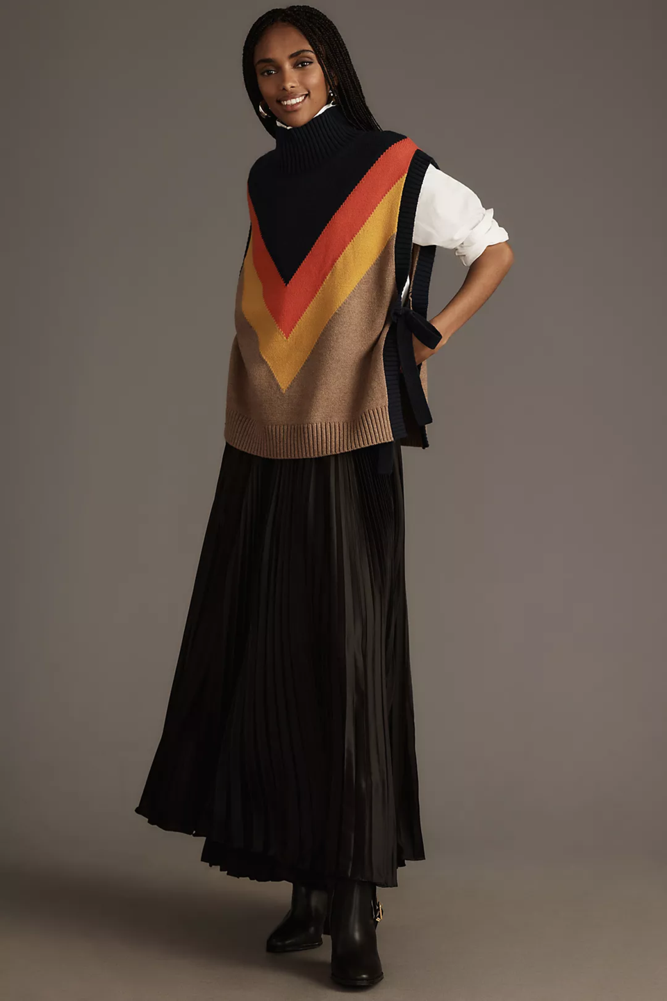
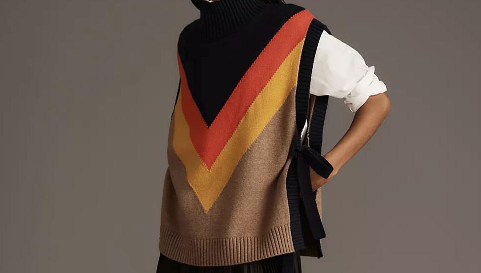
Clothing retailer Anthropologie is that bears a striking resemblance to the Canucks’ V jersey. It comes from the clothing brand Maeve and is described as a “varsity stripe poncho sweater vest.” The 60% cotton, 30% nylon, and 10% wool sweater vest retails for $138.

For Canucks fans, that combination of black, reddish-orange, and yellow with the V-shaped stripes evokes the Canucks’ away jerseys that they wore from 1978 to 1985, as modeled here by Thomas Gradin.
The resemblance hasn’t gone unnoticed. Some Canucks fans on social media have made the connection but it also shows up in the reviews section of the Anthropologie website.
“Â鶹´«Ã½Ó³»canucks reincarnated?” reads one review from jaysera on November 30. “Well a Gen x’er obviously left Yvr to work for Anthro and this is the result. Absolutely hilarious and given that this is the demographic for Anthro, I wonder how well this will do in Yvr. Too funny! A little different indeed! lol.”
As rink apparel goes, $138 is cheaper than the typical jersey, though it will likely be a bit more difficult to customize the sweater vest with a name and number.
This isn't the first time a clothing brand has turned to vintage Canucks jerseys for inspiration. In 2017, Versace blatantly ripped off the Canucks' flying skate logo for a sweater and t-shirt that each cost in the range of $1200.
"An atmosphere that will help create the happy, upbeat, aggressive player."
The Canucks’ V jerseys were put together by San Francisco communications firm Beyl and Boyd and represented a drastic change from the royal blue and kelly green of their original stick-in-rink jerseys.
“With the Canucks uniforms we are going from the coolest of colours — blue-green — to the hottest — red-orange,” . “The cool colour is passive, the hot one aggressive. Plus the black. It’s the contrast of colours that creates emotion. White produces no response at all, so we went for yellow — which is warm, pleasant, happy. Upbeat. What we are attempting to create is an atmosphere that will help create the happy, upbeat, aggressive player — and, hopefully, the happy, upbeat fan. The Canucks want to provide the fan with an atmosphere in which it’s easier for him or her to have fun.”
The jerseys were derided for their Halloween-esque colour scheme and bizarre, logo-less design and have since frequently been featured on lists of the worst jerseys of all time, but there’s something charming about them as well.
For a lot of older Canucks fans, those jerseys are also inextricably linked with the Canucks’ 1982 playoff run, where the underdog Canucks stormed through the playoffs to the Stanley Cup Final led by newly-minted captain Stan Smyl.
Nostalgia has led to a resurgence for the Canucks jersey that followed the V, which featured the V’s shoulder logo of the flying skate and the same colours. That nostalgia hasn’t led to a demand for the return of the V jersey itself, however.
But the sweater vest from Anthropologie suggests that perhaps the V jersey is back in fashion — if it was ever in fashion in the first place.
Pass it to Bulis reached out to Anthropologie but did not receive a response in time for publication.


