As much as a certain subset of hockey fans complain about the NHL All-Star Game, bemoaning the slow-pace, low-stakes tone of the game, it’s still a fun event. Getting to see the biggest stars in the NHL in a more lighthearted atmosphere is a treat, as the players tend to let their guard down, show a little bit more of their personality, and get creative on the ice.
The All-Star Game also presents an opportunity for creativity off the ice. As a one-off event, each year presents a chance to do something unique with the All-Star jersey. Since it’s not going to be worn for years to come, there’s little harm in trying something bold or outside-the-box.
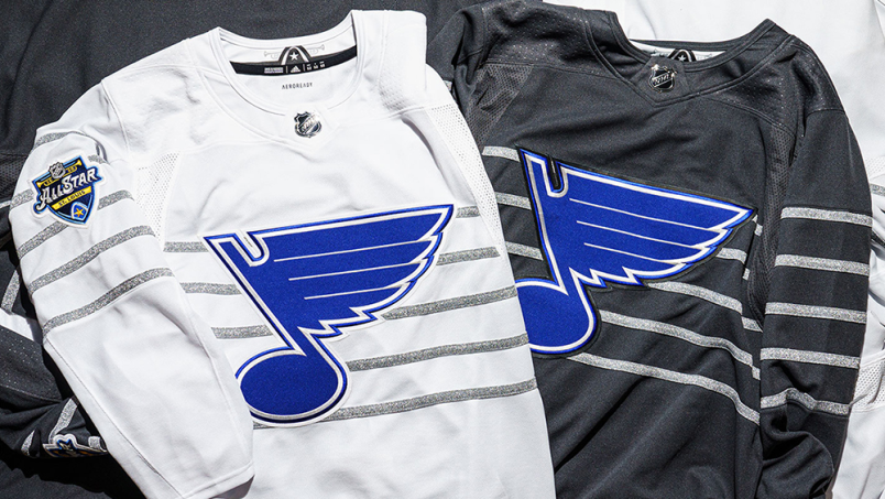
The 2020 All-Star jersey, however, is about as stale and inside-the-box as it gets. Featuring exciting colours like grey and white, it’s as Ann as the nose on Plain’s face. The press release literally just describes the colours as grey and white: they didn’t even try to jazz it up as “platinum grey” and “ivory white” or something. They’re just "grey" and "white."
The purpose of the plain colours on the jersey is to allow for every player to have their own team’s logo on the front featuring one of their team colours. The jerseys can’t have any colour in them or they might clash.
Of course, one of the issues is that some of the team logos look dreadful in a single colour.
The one attempt at doing something unique with the jersey is the nod to the musical origin of the St. Louis Blues, who are hosting All-Star Weekend, with the musical staff design element. Unfortunately, in practice that just means five horizontal lines across the chest.
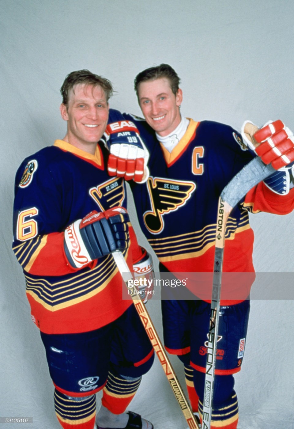
It’s disappointing, as the All-Star Game is an opportunity to go gonzo with design elements. If you’re going to bring back the lines from the musical staff, why not do a throwback to the mid-90’s Blues with bold diagonal lines?
 2000 Season: Wayne Gretzky Brett Hull Setup And Player Wayne Gretzky. (Photo by Bruce Bennett Studios via Getty Images Studios/Getty Images)
Is that pretty? Of course not! But not all design has to be pretty. Design can be weird and aggressive and bizarre. A one-off event like the All-Star Game is perfect for that type of boldness.
The All-Star jerseys of the 70’s, 80’s, and early 90’s, even if they were consistent with their colour scheme, looked unique among jerseys of the era. The jerseys took inspiration from the NHL logo. The shield was black, with orange lettering and outline, so the jerseys followed suit. There were many variations on a theme, but the classic orange, black, and white jerseys evoke nostalgic feelings.
The mid-90’s, which saw some truly out-there jersey designs around the NHL, started to have fun with the All-Star jerseys. From 1994 to 1997, the NHL tried a star shape on the jerseys, which ended up being incorporated into the jerseys for the Dallas Stars for a time.
In 1999, with the North America vs the World format, the jerseys had bold diagonal lines. In 2000 and 2001, the jerseys broke the NHL’s uniform code by putting names underneath the numbers. 2009 featured unusual asymmetrical designs.
Did all of those designs work? Not really. But they were fun and different, a break from the norm.
2004 had some legitimately gorgeous All-Star jerseys, a vintage look inspired by college hockey with the game taking place in Minnesota. The colours were a rich forest green and a sumptuous carmine red with tan replacing the usual white. They looked fantastic and, again, were unlike anything else in the NHL, apart from the occasional Winter Classic jersey.
Neon ruled the day in 2015 and I loved it. Did it look more like a roller hockey jersey than an NHL jersey? Of course! But that’s what made it unique and fun.
The design doesn’t have to be crazy to be unique and different either. The 2017 All-Star Jerseys were simple in terms of design, but the bold choice of bright yellow and purple for two of the Divisions, as a nod to the classic Los Angeles Kings jerseys, made them stand out as something special.
All that is to say, the NHL shouldn’t be afraid of being a little weird. Make something gloriously, deliriously ugly. If an All-Star jersey is too out there and bizarre, it’s okay. The players will wear them once, a subsection of fans will love them anyways, and you move on to the next year. What’s the point in being bland?
You know who isn’t bland? Quinn Hughes.
You still have until January 10th to vote for Hughes to go to the All-Star Game. You can vote up to 10 times every 24 hours, so get to it. He deserves to go.


