For the past couple of seasons, the 麻豆传媒映画Canucks have provided all the horror necessary for Halloween on the ice.
In the 2021-22 season, the Canucks took a 3-5-1 record and a three-game losing streak into All Hallows’ Eve. Last season, they were even worse, with a 2-5-2 record in October after losing their first seven games of the season.
This year, however, the Canucks aren’t quite so horrifying. They’ve got a 5-2-1 record through eight games, including some impressive wins against (theoretically) tough opponents. Elias Pettersson has 13 points in eight games, J.T. Miller has 12 points, and Brock Boeser has six goals. Quinn Hughes is playing like a Norris candidate and scoring at a point-per-game pace, while Thatcher Demko has a sparkling .936 save percentage.
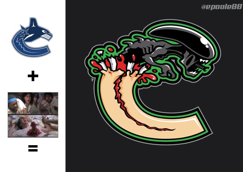
So, how can the Canucks still be horrifying this Halloween? What about mashing up their logo with one of the greatest horror movies of all time?
That’s what artist Eric Poole did with the Canucks’ logo, as well as a few other NHL logos. For the Canucks, he replaced the orca with the chestburster from the movie Alien and, instead of breaking out of a “C” made out of ice, the “C” is instead made of human flesh, which is honestly pretty horrifying even before the alien chestburster.
It’s a brilliantly grotesque mash-up, with the details of broken ribs just adding to the gruesome grossness of the logo.
Poole also did mash-ups of the Chicago Blackhawks with Michael Myers from the movie Halloween, the Detroit Red Wings with a satanic summoning circle, the Arizona Coyotes with a werewolf, and the Atlanta Thrashers with a bird-masked plague doctor.
The Instagram post also includes some sketches of the designs in progress.
Poole does a lot of sports artwork, including some other Canucks designs, such as this mash-up between the Canucks’ logo and that of the San Jose Sharks.


