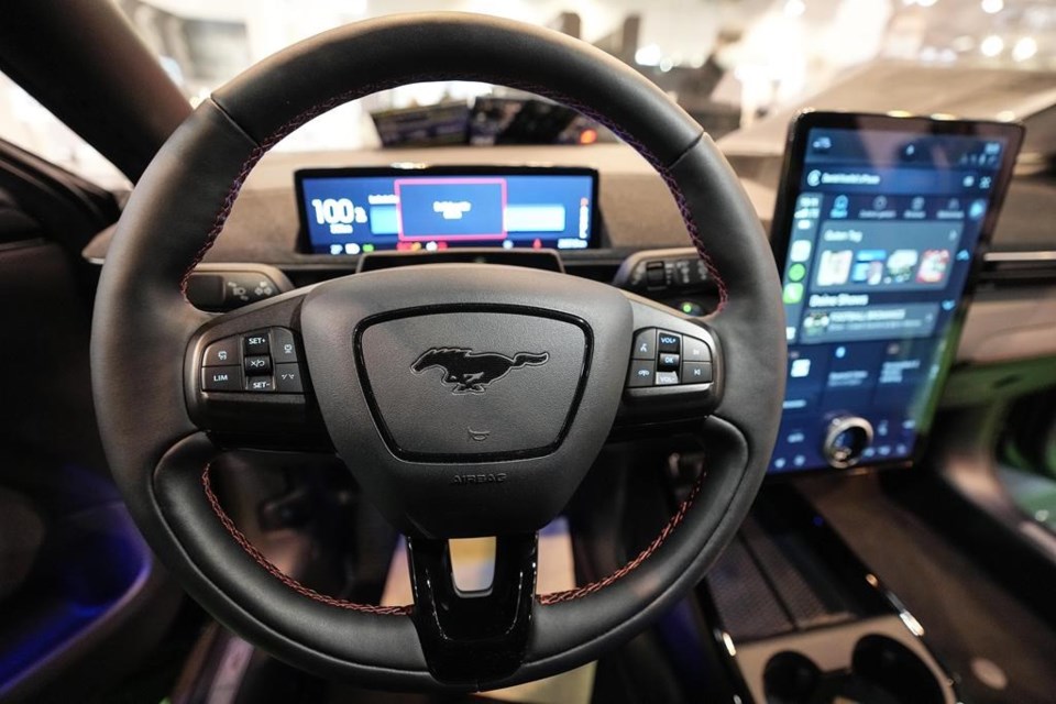
There’s no denying the impact that smartphones and tablets have had on modern vehicles. Look into just about any new car and you’ll find a touchscreen and maybe even a bank of capacitive touch buttons that seek to approximate the function of mechanical buttons. The appeal is obvious: A cabin with these design elements can look sleek and modern. But there are drawbacks that aren’t always considered.
Those who haven’t been in a new car as of late may not know what to look for when evaluating the technology. With this in mind, Edmunds experts have listed a few pros and cons to touchscreen car interfaces to help you determine if this technology is something of interest or a deal-breaker.
PRO: FEWER BUTTONS EQUAL LARGER SCREENS
Most people prefer a large screen to a smaller one, so when automakers remove buttons from the car, it gives them more room to expand the screen. And much like our TVs and smartphones have ballooned in size over the years, so too have vehicle screens. For example, Lexus introduced its small SUV, the NX, in 2015. That model had a 7-inch center screen. Less than a decade later, the 2022 Lexus NX can be had with an optional 14-inch touchscreen. Some models’ screens are even bigger. The Ford Mustang Mach-E has a 15.5-inch center touchscreen, and the all-electric Mercedes-Benz EQS offers an entire dashboard that is one big Hyperscreen. Bigger screens are more legible, provide larger touch targets to interact with, and make it easier to glance at a map.
CON: HIGHER LIKELIHOOD OF DISTRACTION
With touchscreens, drivers must take their eyes off the road to perform most tasks. A simple task such as pulling up a song on Spotify caused drivers to take their eyes off the road for up to an average of 20 seconds, according to a 2020 study by IAM RoadSmart, an independent UK road safety nonprofit. For perspective, the National Highway Traffic Safety Administration guidelines recommend that “devices be designed so that tasks can be completed by the driver while driving with glances away from the roadway of 2 seconds or less.” The study also concluded that the impact on reaction time when using touch control, as opposed to voice control, was worse than texting while driving.
Drive any car long enough and you’ll know where things are just by feel. Think of a physical volume dial, for example. You can locate and turn it without taking your eyes off the road. But that rarely works with a touchscreen because you can’t feel a virtual button.
PRO: MORE FEATURES CAN BE ADDED TO THE VEHICLE
These days a new car’s screen is expected to pull double or triple duty. It needs to not only run the automaker’s software but also display Apple CarPlay and Android Auto smartphone integration systems. Imagine the number of buttons that would be needed to run all three systems.
From the automaker’s perspective, a touchscreen interface saves designers from having to figure out where to add more buttons and gives the interior a cleaner look. A great example is the Tesla Model S. Nearly every feature on the vehicle is located on the center touchscreen. Even features you might not expect, such as the shifter, windshield wipers and lights, are located on the touchscreen.
The Kia EV6 is another notable example. It has a row of capacitive touch buttons that are used for climate controls but can completely change to stereo controls at the press of a specific button. Trouble is that if you want to adjust your temperature and are on the wrong setting, you’ll end up turning up the volume instead.
CON: CENTRAL POINT OF FAILURE
It is great to have more features in a modern vehicle, but the problem with housing them all in one place is that if the screen goes out, you don’t have access to any of those features. This has happened to Edmunds editors on numerous occasions since sometimes the software on new cars isn’t fully baked.
PRO: MORE CUSTOMIZABLE
Since virtual buttons in a vehicle aren’t physically locked into one place, it opens up the doors for customization. On the Tesla Model 3, for example, drivers can rearrange the location of the main on-screen buttons to match their preferences. Similarly, on the 2022 Lucid Air, drivers can create profiles that contain their steering wheel, seat and stereo presets that can be stored and instantly recalled in the event that another member of the house has different preferences.
EDMUNDS SAYS: Everyone has a different preference for the way they interact with a vehicle’s technology. Get a feel for the car’s tech when you’re in the showroom and if you’re not a fan of touchscreen interfaces, consider brands such BMW, Genesis, Mercedes-Benz or Mazda, as they all have control knob interfaces.
_______
This story was provided to by the automotive website . Ronald Montoya is a senior consumer advice editor at Edmunds and is on .
Ronald Montoya, The Associated Press


